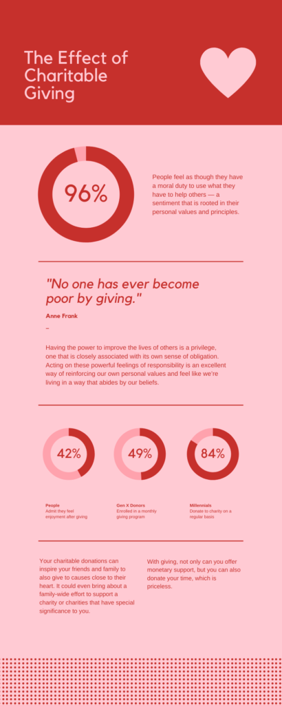
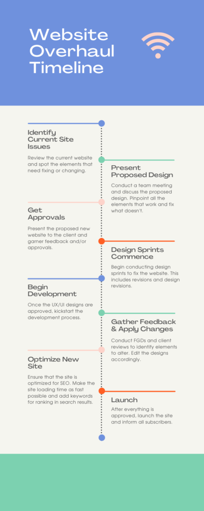
Your mission’s impact is significant, somewhat quantifiable, and difficult to communicate effectively. If this sounds all too familiar, you may need to stop telling and start showing! 90% of the information transmitted to our brains is visual, which is one of the many reasons infographics have become popular in recent years (MIT). In fact, high quality infographics are 30x more likely to be read than plain text (Neil Patel).
It’s clear that as our attention spans continue to grow shorter as the amount of information available to us grows larger, infographics will help transform dense information or data into a fascinating story. Infographics are also more likely to lead to an emotional response which helps spur donor action and increase awareness of your mission. So, put times new roman to the side and create some stellar infographics to portray your impact! Here are some tips to get you started.
When to use infographics
It is possible to have too much of a good thing, so it’s important to be choosy and only use infographics where they make sense. Good examples of these scenarios would be:
When you want your audience to come to a quick conclusion
When you’re describing a timeline
When you are comparing two topics
When you have a story to tell
How to create infographics
One of the perks of having endless information at our fingertips is access to free or affordable tools. There are several design tools out there to help you create stunning infographics even with little to no design experience. And as we know, nonprofit professionals wear many hats, so here are our favorite design tools that are well-suited for both the beginner and the seasoned designer.
- Canva – Canva has a great library of pre-made infographic templates that can be easily altered to match the message and branding of your organization. They also offer CanvaPro to 5013c organizations for free! That alone makes it a winner. But it also has a great user experience, a broad set of tools, and a simple folder structure to organize all the cool new work you’ll want to create in there.
- Venngage – Venngage is praised for its solid user experience and allows you to create your own graphics. And they’re always in on the newest design trends, so the templates make for perfect starting points. While not free, they do offer special nonprofit pricing just for you.
- Piktochart – Piktochart works similarly to Canva and Venngage but excels when it comes to collaboration. Teamwork has never been easier with the ability for the creator to gather feedback and streamline the design process, allowing you to get content to your audience quickly and efficiently.
A few best practices
1. When creating an infographic, the three biggest questions to keep top-of-mind are:
- Does it deliver the message I’m trying to convey?
- Does it fit my organization’s brand?
- Is it engaging enough for a reader to stop scrolling and absorb the information?
To make sure you’re hitting your marks, it’s always helpful to have a second pair of eyes review your new design. Your teammate may see a typo you missed, have a different takeaway than you expected, or offer up a great idea you hadn’t thought of.
2. Match the color scheme of your infographic to the exact brand colors of your organization, and make sure you’re aware of any guidelines around your colors and typography. This unites the infographic with your brand for a cohesive and intentional final product.
3. Take your time and get creative! Add or remove elements until you’re happy with the outcome and the message is clear. Then, put yourself in your audiences’ shoes. Would you stop to look at the information presented? What are your first and last impressions? If your final product is more eye-catching than a paragraph in times new roman, mission accomplished.
Looking for design assistance?
 Hannah brings a fresh perspective to clients' digital experiences. With her keen visual sense and expertise in design, she ensures that projects are engaging, attractive, functional, and user-friendly. She has contributed to successful campaigns and web design projects with Diabetes Canada, Beth Israel Deaconess Medical Center, Friends of Firefighters, and Safe Harbor.


